
Market Insights
How to Read a Gold Price Chart: A Beginner’s Guide
Aug
Gold has fascinated investors and savers for thousands of years, and today it’s easier than ever to track its value in real time. But when you pull up a gold price chart for the first time, all those lines, numbers, and time frames can feel overwhelming. The good news is that reading a gold price chart is a learnable skill, and once you understand the basics, you’ll be able to make more confident decisions about buying or holding physical gold. This guide breaks it all down in plain language so you can get started right away.
What a Gold Price Chart Is Actually Showing You
A gold price chart plots the price of gold over a selected period of time. The vertical axis (the Y-axis) shows the price, usually expressed in US dollars per troy ounce. The horizontal axis (the X-axis) shows time. As you move from left to right, you’re moving forward through time, and the line or bars on the chart show how the price changed during that period.
Most charts you’ll encounter quote gold in terms of the spot price — the current market price for immediate delivery of one troy ounce of gold. This is different from the retail price you’d pay for a physical coin or bar, which includes a small premium above spot to cover minting, distribution, and dealer costs. When you visit absolutebullion.com, you can see live spot pricing alongside the actual purchase price for physical products.
It’s important to understand that a chart is a historical record. It tells you what gold has done, not what it will do. That’s a crucial distinction, especially for new buyers who might be tempted to treat past performance as a guarantee of future results. Use the chart as context, not as a crystal ball.
Understanding the Different Time Frames
One of the first choices you’ll make when looking at a gold chart is selecting a time frame. Common options include one day, one week, one month, one year, five years, and ten years or more. Each time frame tells a different story, and it’s worth looking at more than one before drawing any conclusions.
Short time frames — like one day or one week — show you recent volatility and daily price swings. These are useful if you’re trying to time a purchase within a short window. However, daily fluctuations are often driven by currency movements, interest rate speculation, or geopolitical headlines that may not reflect long-term trends.
Longer time frames — like five or ten years — give you a broader view of how gold has behaved across different economic cycles. They help you see patterns, major peaks, and major troughs in context. For most physical gold buyers who are thinking about preserving wealth over years rather than days, the long view is the more meaningful one.
Line Charts vs. Candlestick Charts
Gold price charts come in different visual formats. The two you’ll encounter most often are line charts and candlestick charts. A line chart is the simpler of the two — it connects closing prices for each period with a single continuous line. It’s clean, easy to read, and great for spotting overall trends at a glance.
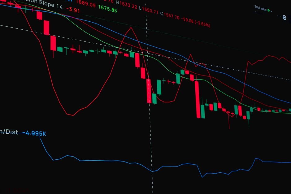
A candlestick chart shows more detail for each period. Each “candle” represents a specific time interval and displays four data points: the opening price, the closing price, the highest price reached, and the lowest price reached during that period. The body of the candle shows the range between open and close, while thin lines above and below (called “wicks” or “shadows”) show the high and low extremes.
For most beginners buying physical gold, a line chart is more than sufficient. Candlestick charts are more relevant to active traders analyzing short-term market behavior. If your goal is to understand gold’s general direction and historical performance, stick with the line chart until you feel comfortable.
Key Terms You’ll See on Gold Charts
Getting comfortable with a few basic terms will make reading any gold chart much easier. Here are the ones that matter most:
- Spot price: The real-time market price for one troy ounce of gold for immediate settlement.
- Support level: A price range where gold has historically found buyers, preventing the price from falling further.
- Resistance level: A price range where gold has historically struggled to break higher, as sellers step in.
- Trend: The general direction the price is moving — upward (bullish), downward (bearish), or sideways (consolidating).
- Volume: The amount of gold traded during a given period. Higher volume often signals stronger conviction behind a price move.
- Moving average: A smoothed-out average of prices over a set number of days, used to filter out short-term noise and identify the underlying trend.
You don’t need to master all of these terms right away. Even understanding spot price, trend, and support and resistance levels will give you a meaningful advantage when evaluating whether a particular moment feels like a sensible time to buy.
What Drives Gold Prices Up and Down
A chart shows you the what — but understanding the why behind price movements helps you interpret what you’re seeing. Gold prices are influenced by a variety of factors that often interact in complex ways. The most significant include the strength of the US dollar, real interest rates, inflation expectations, central bank buying activity, and global uncertainty events such as financial crises or geopolitical conflicts.
Gold tends to rise when confidence in paper currency falls, when inflation is climbing, or when investors are seeking a safe haven from uncertainty. It tends to face downward pressure when interest rates rise significantly, because higher rates make yield-bearing assets like bonds more attractive by comparison.
When you look at a chart and notice a sharp spike upward, it’s worth asking what was happening in the world at that time. More often than not, you’ll find a news event or economic shift that explains the move. Building that habit of connecting price movements to real-world context will make you a much more informed buyer.
How to Use a Gold Chart When Buying Physical Gold
Checking a gold price chart before making a purchase is simply good practice. It helps you understand whether you’re buying near a recent high, a recent low, or somewhere in the middle of a range. None of this predicts the future, but it gives you useful context for your decision.
A practical approach is to look at both a one-month and a one-year chart before buying. If prices have recently dipped from a higher level and appear to be stabilizing, that may feel like a more comfortable entry point than buying at an all-time peak. Again, no approach eliminates risk, but an informed buyer is always better positioned than an uninformed one.
Reading a gold price chart is a skill that gets easier with practice, and it’s one of the most useful tools you can develop as a physical gold buyer. Start by checking charts regularly, even when you’re not planning to buy, so the patterns and terminology become familiar over time. When you’re ready to make a purchase at current spot price, Absolute Bullion offers a straightforward buying experience with live pricing and a wide selection of coins and bars to suit any budget. The more you understand the market, the more confident you’ll feel every step of the way.
