
Market Insights
How to Read a Gold Price Chart: A Beginner’s Guide for Smart Investors
Aug
Gold has fascinated investors for centuries, but understanding how to read a gold price chart can feel overwhelming when you’re just getting started. A chart is simply a visual record of how the price of gold has moved over time — and once you know what to look for, it becomes one of the most useful tools in your investment toolkit. Whether you’re considering your first gold purchase or trying to understand the market a little better before you buy, this guide will walk you through the basics in plain English.
What a Gold Price Chart Actually Shows You
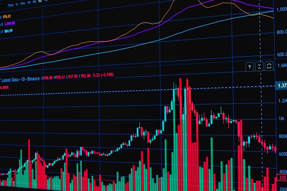
At its most basic level, a gold price chart plots the price of gold on the vertical axis (up and down) against time on the horizontal axis (left to right). As you move from left to right across the chart, you’re moving forward in time. When the line rises, gold’s price went up during that period. When it falls, the price dropped. Simple enough — but there’s more to it than just watching a line move.
Most gold charts display price in U.S. dollars per troy ounce. The troy ounce is the standard unit of measurement for precious metals and weighs slightly more than a regular ounce. You’ll also notice that you can change the time frame displayed — from one day all the way out to decades. Looking at a one-year chart tells a very different story than looking at a ten-year chart, and experienced investors study both.
When you first open a gold price chart, don’t focus on today’s exact number. Instead, try to get a sense of the overall direction of the line over the period you’re viewing. Is it trending upward, downward, or moving sideways? That big-picture view is called the trend, and it’s the foundation of chart reading.
Understanding Support and Resistance Levels
Two of the most important concepts on any price chart are support and resistance. These terms describe price levels where gold has historically had difficulty moving below or above.
Support is a price level where gold tends to stop falling and bounce back up. Think of it as a floor. When prices drop toward that level, buyers tend to step in because they view it as a good value, which pushes the price back up. Resistance is the opposite — a ceiling where gold tends to struggle to break through higher because sellers start cashing in their profits at that level.
Spotting these levels is straightforward. Look for points on the chart where the price reversed direction multiple times. If gold dropped to a certain price three different times and bounced back up each time, that’s a clear support level. These zones are useful because they give you context for where the price might find stability or face pushback in the future.
Time Frames Matter More Than You Think
One of the most common mistakes new investors make is looking at only one time frame. A chart showing gold’s price over the last 24 hours will look completely different from one showing the last five years — and both tell you something important.
Short-term charts (daily or weekly) show you recent volatility and near-term price swings. These are useful if you’re trying to time a purchase and want to see whether prices have been rising or dipping lately. Long-term charts (five years, ten years, or more) show you gold’s behavior through full economic cycles, including recessions, periods of inflation, and financial crises. This broader perspective helps you understand gold’s role as a long-term store of value.
A good habit is to start with the long-term chart to understand the overall trend, then zoom in to a shorter time frame to get a clearer picture of recent price action. Think of it like getting directions — you look at the full map first, then zoom in to your street.
Key Chart Patterns Every Beginner Should Recognize
Over time, gold price charts tend to form recognizable shapes that analysts use to anticipate future price movement. You don’t need to memorize dozens of patterns, but a few basics are worth knowing.
- Uptrend: A series of higher highs and higher lows. Each peak and each valley is higher than the last — a sign of sustained buying pressure.
- Downtrend: The opposite — lower highs and lower lows, suggesting sellers are in control.
- Sideways channel: Price bouncing back and forth between a consistent support and resistance level. This often signals indecision in the market.
- Breakout: When price pushes convincingly above a resistance level or below a support level, often followed by a significant move in that direction.
These patterns aren’t guarantees — no chart pattern predicts the future with certainty. But they give you a framework for understanding what buyers and sellers are doing at any given moment, which is genuinely useful when deciding whether to buy or wait.
What Drives Gold Price Movements
Reading a chart is more meaningful when you understand the forces behind the price moves you’re seeing. Gold tends to rise when investors are worried — about inflation, economic slowdowns, currency weakness, or geopolitical instability. It tends to fall or stall when confidence in the economy is high, interest rates are rising, or the U.S. dollar is strengthening.
On a chart, you’ll often notice sharp spikes or drops that correspond to major news events. Central bank announcements, inflation data releases, and global crises can all send gold moving quickly. These sudden moves are called volatility spikes, and they’re a normal part of the gold market.
Understanding the “why” behind price moves helps you avoid panic. If gold drops sharply on a single news day, a long-term chart often shows you that similar dips have occurred before — and that the broader trend eventually reasserted itself. Context is everything.
How to Use Charts When Buying Physical Gold
Chart reading isn’t just for traders watching screens all day. It’s genuinely practical for anyone buying physical gold coins or bars. Before making a purchase, a quick look at the chart can tell you whether you’re buying at a recent high or during a pullback — useful information even if you’re a long-term holder.
At current spot price, gold may look expensive compared to six months ago, or it may look like a relative dip compared to last year — the chart tells you which. You can check live pricing and current spot rates directly at absolutebullion.com, where Absolute Bullion lists up-to-date prices on coins, bars, and rounds across gold, silver, and platinum.
Remember that physical gold buyers typically pay a small premium above the spot price to cover minting, handling, and dealer costs. Tracking the chart helps you understand what the baseline spot price is doing so you can evaluate what you’re paying with confidence.
Learning to read a gold price chart is a skill that pays off over time. You don’t need to become a technical analyst — just understanding trends, support and resistance, and what drives price movement puts you ahead of most first-time buyers. Start by spending a few minutes with a chart before any purchase, and over time it will start to feel second nature. Visit absolutebullion.com to explore current gold products and check live spot prices as you put your new chart-reading skills to work.
