
Market Insights
How to Read a Gold Price Chart: A Beginner’s Guide for Investors
May
If you’ve ever looked at a gold price chart and felt overwhelmed by the lines, spikes, and unfamiliar terms, you’re not alone. Gold charts can look intimidating at first glance, but once you understand the basic building blocks, they become one of the most useful tools you have as a precious metals investor. Reading a chart correctly helps you make smarter buying decisions, understand market trends, and avoid the common mistake of reacting emotionally to short-term price swings. This guide breaks everything down in plain language so you can start reading gold price charts with confidence.
What a Gold Price Chart Actually Shows You
At its core, a gold price chart is a visual record of how the price of gold has changed over time. The horizontal axis (the bottom of the chart) represents time, while the vertical axis (the side of the chart) represents price, usually measured in US dollars per troy ounce. Every point on the chart corresponds to the price gold was trading at a specific moment in time.
Charts can display different time periods — ranging from a single day to several decades. A short-term chart might show you price movements hour by hour, while a long-term chart gives you a bird’s-eye view of gold’s historical performance across years or even decades. Most beginner investors benefit from spending time with both: the long-term chart puts current prices in perspective, while shorter time frames help you identify recent trends.
Gold prices shown on these charts typically reflect the spot price — the current market price for immediate delivery of one troy ounce of gold. This is the benchmark price used by dealers, traders, and investors worldwide. When you shop for coins or bars at absolutebullion.com, the prices you see are based on the current spot price plus a small premium that covers production, distribution, and dealer costs.
Understanding Chart Types: Line, Bar, and Candlestick
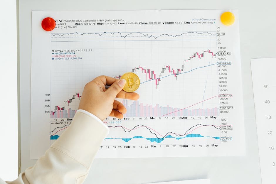
Not all gold charts look the same. The three most common formats are line charts, bar charts, and candlestick charts. A line chart is the simplest — it connects the closing price of each time period with a continuous line. This makes it easy to see the overall direction of price movement without getting distracted by detail.
A bar chart adds more information. Each vertical bar represents a single time period (one day, one week, etc.) and shows the opening price, closing price, and the high and low reached during that period. This gives you a clearer picture of price volatility within any given time frame.
Candlestick charts are the most widely used among serious investors. Each “candle” shows the same four data points as a bar chart — open, close, high, and low — but in a more visually intuitive format. The body of the candle is filled or hollow depending on whether the price rose or fell during that period. Candlestick charts make it easier to spot patterns quickly once you become familiar with the format.
Key Terms You’ll Encounter on Gold Charts
A few essential terms come up constantly when reading gold price charts. Understanding them removes a lot of the confusion:
- Spot Price: The real-time price at which gold is trading on global markets.
- Support Level: A price point where gold has historically stopped falling and bounced back up. Think of it as a floor that the price tends to respect.
- Resistance Level: The opposite of support — a price ceiling that gold has historically struggled to break through.
- Trend: The general direction of price movement. An uptrend means prices are making higher highs and higher lows over time. A downtrend is the reverse.
- Moving Average: An average of gold’s price over a set number of days (commonly 50 or 200 days), smoothed into a line on the chart. It helps filter out day-to-day noise and reveals longer-term direction.
- Volume: The amount of gold traded during a specific period. High volume during a price move often signals that the move is meaningful rather than a random blip.
You don’t need to memorize every technical indicator available. Starting with support, resistance, and moving averages gives you a solid foundation for interpreting what a chart is telling you.
How to Spot Trends and What They Mean for Buyers
Identifying a trend is one of the most practical skills a gold investor can develop. When you zoom out on a long-term gold price chart, you can see distinct periods where prices trended strongly upward, moved sideways, or declined. These trends are driven by factors like inflation, interest rates, currency strength, geopolitical uncertainty, and investor sentiment.
For buyers of physical gold — coins, bars, and rounds — trend analysis helps with timing. Buying during a period when prices are near established support levels, rather than at a recent peak, can mean getting more ounces for your money. That said, trying to perfectly time every purchase is nearly impossible and often counterproductive. Many experienced investors use a strategy called dollar-cost averaging — buying a fixed dollar amount of gold at regular intervals regardless of price — to reduce the impact of short-term volatility.
It’s also worth understanding that short-term price dips rarely tell the full story. Gold has shown long-term resilience as a store of value, but past performance never guarantees future results. Charts are informational tools, not crystal balls.
Common Mistakes Beginners Make When Reading Charts
One of the most frequent errors new investors make is focusing exclusively on short time frames. Watching hourly price moves can feel dramatic and urgent, but it often leads to impulsive decisions. Always zoom out to the weekly or monthly view before drawing any conclusions about where gold is headed.
Another common mistake is treating every dip as a crisis or every rally as a guaranteed continuation. Gold prices are influenced by a complex mix of global forces, and no single indicator tells the complete story. Use charts as one input among several, alongside fundamental research and awareness of macroeconomic conditions.
Finally, avoid the trap of overcomplicating your analysis. Beginners sometimes layer on so many technical indicators that the chart becomes unreadable noise. Start with a clean line chart, add one or two moving averages, and identify visible support and resistance zones. Simplicity is often more effective than complexity.
Where to Find Reliable Gold Price Charts
Reputable free resources for gold price charts include websites like Kitco, GoldPrice.org, and the World Gold Council. These platforms offer interactive charts with adjustable time frames and various display options. Many allow you to compare gold’s price history against inflation, other commodities, or major currencies — context that makes the data far more meaningful.
When you’re ready to act on what you’ve learned, checking the live spot price before you buy is always a smart step. At Absolute Bullion, you can view current pricing on a full selection of gold coins, bars, and rounds so you always know exactly what you’re paying relative to spot.
Reading a gold price chart is a skill that improves with practice. Start simple, watch the charts regularly, and resist the urge to overreact to daily fluctuations. Over time, you’ll develop a feel for how gold moves and what those movements mean for your purchasing decisions. Visit absolutebullion.com to explore live gold pricing and find the right product for your portfolio today.
